Prototypes: The Final Frontier
May 21, 2020
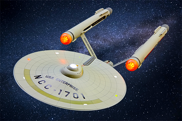
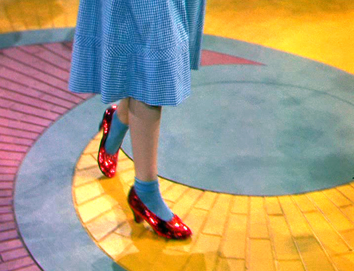
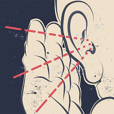
In Star Trek the popular sci-fi franchise, their spaceship the USS Enterprise was built to explore space, the final frontier. It was a marvel of technology and totally fake. It’s a movie, after all! But the point is that they built a model of a spaceship and then proceeded to use this prototype as if it was real.
And in user experience design, that’s what a prototype is – something that looks and feels like the real thing but has no code behind it.
What is a prototype?
Software design is complicated and building an app requires user research, ideation, design and testing. This is where prototypes come in. After the wireframing stage (see Wireframe your way to a successful app. Even Dory can do it!) where you’ve worked out the major kinks in the app, you’ll create a prototype with popular software like Axure or InVision. This prototype behaves and looks like the real software app, only there is no code behind it. Just like the USS Enterprise, it looks real but there’s nothing under the hood.
Why build a prototype?
The purpose of building a prototype model of anything is to test it with people to make sure the product operates correctly and makes sense to the user of the product. Most products have some version of a prototype for just this reason. Software design methods usually include research, build and test phases to ensure that the product is built to design specs and meets the user’s needs.
Secondarily, prototypes are used to convey the app design to internal stakeholders such as managers and developers. If seeing a picture is worth a thousand words, a prototype is worth a million.
The final reason for building a prototype comes down to money – it costs much more money to fix a software error after production than it does in the design phase. Some statistics cite a 100-fold price increase in post-production fixes as compared to pre-production fixes. Testing prototypes can save money by finding errors and avoiding costly post-production fixes. And in mission critical apps or products, like a spaceship, it becomes a matter of safety for the user.
‘Make it so’ with prototype design
You can create a prototype with a variety of specialized software apps such as Axure, InVision or Sketch. Axure has a steep learning curve, but provides the most functionality, even allowing for JavaScript-driven interactions and conditional if-else statements. This enables you to create very realistic prototypes.
InVision is easier to learn but does not offer the depth of Axure in its capabilities. Sketch, another popular tool, has simple screen-to-screen interactions and is very easy to learn. Sketch also works with other 3rd party tools to extend the interactive nature of the prototypes.
Before starting a prototype you need the following assets – a style guide that spells out the fonts and color palette to use, wireframes that define the information architecture and a visual design that will be used consistently throughout the app.
Summary
Prototypes are the vehicle for user testing and yield valuable insights into how someone uses an app. As people become more technically savvy, they expect software apps not only to work, but to be easy to use, intuitive and delightful.
So, it’s important that the first release of an app stays on target by addressing the user’s goals and frustrations. This is achieved by testing the prototype with target users. As Spock said, "Insufficient facts always invite danger." With prototypes, whether it’s a spaceship or a banking app, user testing will provide hard data on the pending success or failure of your app.
Mr. Spock would definitely do user testing after creating a prototype. I’ll explain more about user testing in our next post. Stay tuned!
Wireframe your way to a successful app. Even Dory can do it!
April 05, 2020
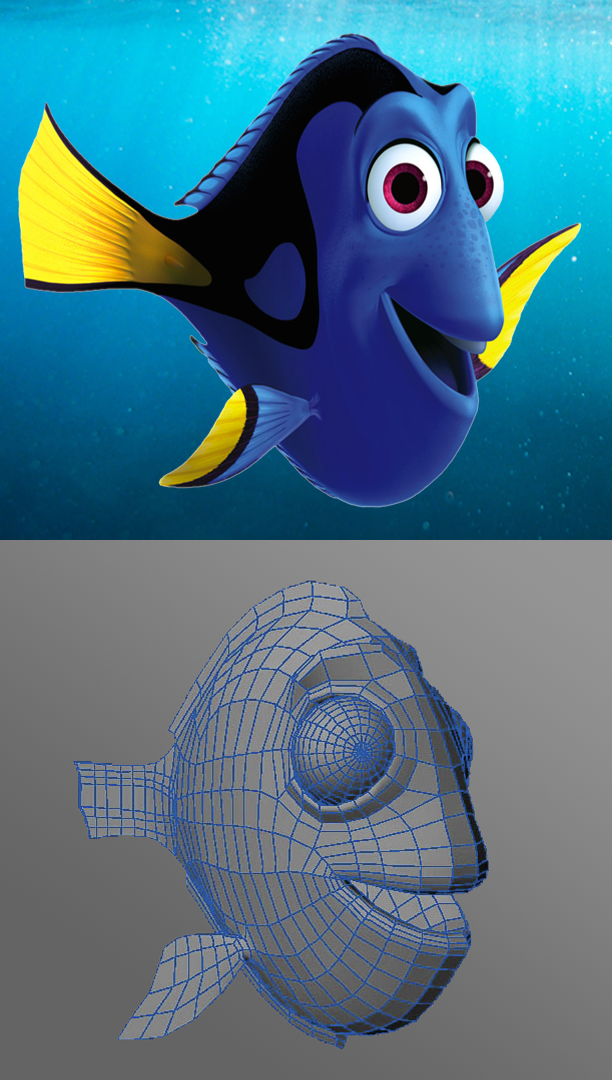
When Pixar made the animated film “Finding Nemo”, they didn’t start out right away with a 3D image of Dory. Pixar spent hundreds of hours studying the behavior of real underwater sea life to draw images of a fish like Dory.
That key step helped them create a wireframe of Dory’s structure. The wireframe defined the structure of Dory’s parts – eyes, mouth, tail, fins and body. As John Lasseter, the executive producer says, “I always believe in research. No matter what the subject matter is, you can’t do enough research.” And that’s what makes the movie so good!
Here’s the bad news. Creating wireframes for software apps also requires hours of research (although not underwater) to inform the design about the information architecture, content and navigation.
What’s the good news? By taking the time to do wireframing the right way, you’ll save yourself hours of time and wasted work.
What is a wireframe?
A wireframe is a black and white drawing (by hand or computer) that lays out all the elements of a screen for your app. Each wireframe shows how all the different sections of the screen go together. This includes the navigation bar, how the information is laid out on the screen, where the content and the components go. It doesn’t have to be pretty, just descriptive.
It’s important at this early stage to render the wireframe in black and white instead of color. Why? Because we are visual creatures that assign meaning and patterns to the world around us. We can’t help but process colorful visual information.
That’s why we exclude color at this stage. Colors are powerful and have many meanings. With wireframes, you want the viewer to focus on the screen architecture, not the colors used in the display. In testing the wireframes, getting the user’s feedback on the information architecture is essential.
When do you start creating wireframes?
Just as in Finding Nemo, wireframes are created after you have conducted user research (see 'Don’t miss the most important step of UX Design'). Once you have discovered and understand the users’ needs, goals, motivation and pain points, you’ll have empathy and enough information to start creating wireframes.
It’s crucial to know the tasks that the user expects to take in order to complete a goal, and equally important to understand their frustrations. This empowers you to create an app that matches the user’s mental model (how they think something should work).
How do you create a wireframe?
- You can create a wireframe by putting pencil to paper. This is effective if you don’t have experience with any prototyping tools. The downside to paper though is that editing the wireframes will be time consuming and involve a lot of re-drawing.
- As you progress with iterative design this method will soon become very cumbersome. I recommend using a tool designed for wireframes. Some popular apps are Sketch, Adobe XD, Axure, Balsamiq and InVision.
- Regardless of the tool you choose, start with drawing a rectangle that represents the screen size of the device you are designing for (desktop, tablet, or mobile).
- Next, draw the static elements like the header bar, main menu and footer.
- Finally, select an area for your content and decide how you will lay it out in terms of columns and/or rows. Many of the authoring apps provide a grid system that you can overlay on top of the drawing. You have just created a template that you can use for all the wireframes of your app!
User testing with wireframes
The whole point of wireframes is to visualize the concept of your app. Wireframes are a great way to communicate your ideas with not only end-users but internal stakeholder like product managers or even the CEO. Seeing the path of how a user moves through your app tells your story better than just text. In movies, this series of wireframes is called a storyboard, of which many were produced for Finding Nemo.
Testing can be informal, what I call ‘Hallway’ testing. With this method, you literally show the wireframes to a peer and ask them what they think, what they would click on and what they would expect to happen after clicking a button. A few of these Hallway testing sessions are an easy way to get early feedback.
More formal usability testing can be conducted using wireframes. Usability tests are comprised of a set of tasks that the user needs to take in order to accomplish a goal. Your wireframes should support and show that path. Have the user look at the wireframes and pretend to perform the tasks as if it were a live app. Be sure to ask them what they just did and what did they expect to happen. For more information on usability testing, be sure to read “To Create the Best App, Make Sure You Do Usability Testing Right”.
Summary
The wireframe provides for a consistent and user-friendly presentation of data. Add up all the wireframes and you have a story for your app that shows how the users move through the screens in order to complete their goals. This is the perfect method for telling your story in a compelling way. And, wireframes give you an opportunity to do informal or formal usability testing.
Remember, Dory wouldn’t be Dory without extensive research and wireframing. And, your app is no different – it requires user research, wireframes and usability testing. That’s how you create a killer app!

How is a Heuristic Evaluation like a Spoonful of Sugar?
February 10, 2020
A Heuristic evaluation is a review of an existing app that is based on the 10 usability design principles originally developed by Norman Nielsen in 1990. It can be a dry and dusty process. So I’m offering a different, more whimsical approach in the most delightful way -- enter Mary Poppins!
In the musical ‘Mary Poppins’, Julie Andrews literally floats into the Banks’ household to become the children’s nanny, leaving their dad, Mr. Banks a little befuddled. She proceeds to evaluate how things are done in the Banks home and starts changing the norms for the benefit of the entire family.
In the song ‘A Spoonful of Sugar’ Mary Poppins explains how turning a task into something fun makes it more enjoyable.
What Mary Poppins did was a sort of a heuristic review – she evaluated the current situation against expert criteria (hers, of course) and found ways to make tasks more enjoyable and delightful. And that is the purpose of conducting a heuristic review of software – to find the pain points and make recommendations for how to make the app easier and more enjoyable to use.
What is a Heuristic Evaluation?
A Heuristic evaluation is a review of an existing app that is based on the 10 usability design principles. These 10 principles have become the foundation of UX design. The evaluation is conducted by a UX expert in order to uncover usability issues. This is a fairly inexpensive and quick method for getting usability feedback.
The 10 Usability Design Principles
So, what are these principles… that Mary Poppins surely would use if she were a UX Designer? Below is a short description of each principle:
- Visibility of System Status – This means that the computer lets the user know what’s going on, such as error messages or progress bars.
- Match between System and the Real World – Use conversational language and familiar ideas and concepts.
- User Control and Freedom – Empower the user with the ability to undo an action and the ability to leave an unwanted situation.
- Consistency and Standards – Be consistent in use of language, navigation, buttons, icons and layout. And use standards that are universally used and understood, like the menu item ‘About Us’.
- Error Prevention – Eliminate error-prone actions, like having the user type in the name of a state instead of choosing from a dropdown list.
- Recognition rather than Recall – Lessen the user’s memory load by making objects and actions visible. It’s easier to recognize something than recall it from memory.
- Flexibility and Efficiency of Use – Make your system flexible enough to accommodate expert and novice users by, for example, listing options like ‘Advanced Settings’.
- Aesthetic and Minimalist Design – Basically this means to keep it simple. Dialogues should not contain information which is irrelevant or rarely needed. Graphics should be used sparingly, only presenting information needed for the task.
- Help Users Recognize, Diagnose, and Recover from Errors – Error messages should be easily visible, written in natural language, describe what the error is and suggest how to recover from it.
- Help and Documentation – Help should be easily accessible, easy to search, list concrete steps and be short in length.
When do you Conduct a Heuristic Evaluation?
A heuristic evaluation is performed on an existing app. This can be at the beginning of a redesign project to establish a usability baseline. You can also do a heuristic evaluation on a newly released or mature product to uncover hidden usability issues. It’s a fast and easy way to assess an app’s usability. If Mary Poppins worked in software, she would definitely do a heuristic evaluation!
How do you Conduct a Heuristic Evaluation?
The heuristic evaluation is conducted by a UX expert – someone who knows the 10 usability principles and how to apply them. First, the expert does a walkthrough of your app just to get familiar with it. The expert may have questions for a subject matter expert as to how the application works.
Secondly, the UX expert starts analyzing the interface to see how it does or does not adhere to the usability principles. Is the navigation consistent throughout the app? Does the app avoid error-prone actions? Is the app using aesthetic and minimalist design? These are some of the questions that the UX expert needs to consider.
What would Mary Poppins do now?
If Mary Poppins were a UX expert, her next step would be to write up a report outlining her methodology, findings and recommendations. There is no one right way to create this report. Just remember that data visualization will help tell a story. And, keep the report as short and concise as possible. Your goal is to communicate and demonstrate the areas of the interface that are in need of attention in order to improve the app’s usability.
You can improve the user experience for your customers by conducting heuristic reviews – just the spoonful of sugar that makes task more enjoyable to complete. Mary Poppins would approve!

What the heck is a SUS survey and why should you care?
January 2020
In the movie Moneyball, Brad Pitt plays the Oakland A's general manager Billy Beane in the year 2001. He is challenged by a low budget to assemble a baseball team. Billy puts his team together by using computer-generated analysis to acquire new players. Of course, the team scouts object, being used to relying on anecdotal evidence to choose players. How can you take qualitative information and treat it as if it’s quantitative?
Assessing the usability of an app is like choosing baseball players with statistical analysis – using math to determine the usability. The math in this case is called the SUS (System Usability Scale) survey. It takes qualitative information and turns it into quantitative information.
What is SUS?
SUS was developed in 1986 as a tool to be used in usability engineering of electronic office systems. Today, it still stands as the industry standard in software usability measurement. SUS is a simple, ten-item attitude Likert scale (a 5-point scale from Strongly Agree to Strongly Disagree) of subjective assessments of usability. This survey only takes about 5 minutes to fill out.
Why should you care about SUS?
The survey is easy and inexpensive to administer, can be conducted on a small scale and has proven to be very reliable over the years. A SUS survey can accurately classify the ease-of-use of a software application with just 10 questions. The scoring is complex, so I’ve provided you with a SUS scoring template that you can use for free.
The SUS questions
- I think that I would like to use this system frequently.
- I found the system unnecessarily complex.
- I thought the system was easy to use.
- I think that I would need the support of a technical person to be able to use this system.
- I found the various functions in this system were well integrated.
- I thought there was too much inconsistency in this system.
- I would imagine that most people would learn to use this system very quickly.
- I found the system very cumbersome to use.
- I felt very confident using the system.
- I needed to learn a lot of things before I could get going with this system.
When do you administer the SUS survey?
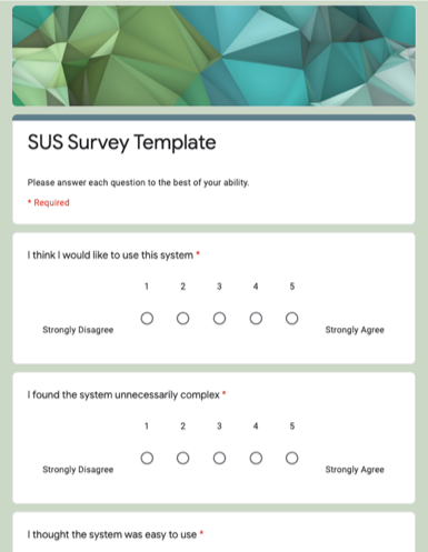 The SUS survey is intended for a mature product, that is, one that is released. You can also perform a SUS survey on a high-fidelity interactive prototype (as long as it mimics the features and functionality of the finished product). In this way, you could uncover usability problems before you commit to any coding. The survey can be on paper or online. I’ve created the survey using Google Forms. This makes collecting and downloading data very easy.
SUS Scoring
The scoring is a little complex. Even questions are scored differently than odd questions. All scores are added together and then multiplied by 2.5 to convert the original scores of 0-40 to 0-100. Though the scores are 0-100, these are not percentages and should be considered only in terms of their percentile ranking.
Luckily, I’ve created a SUS scoring template you can use that will automatically score the results.
How do I interpret the results of a SUS survey?
As I mentioned, the scoring is a little complex and they are not percentages. But all you need to know is that ‘average’ usability is a score of 68. Anything over that is better, anything under is worse. In the free SUS scoring template, I’ve included a matrix from ‘A’ to ‘F’ to put the scores in context of grading performance.
SUS is the BOSS
SUS surveys are a great method for determining the usability of your app. It’s fast, easy and inexpensive to conduct. The SUS survey is a proven and trusted analysis of ease-of-use. The next time you need to benchmark your app’s usability, try a SUS survey – you’ll hit a home run!
To Create the Best App, Make Sure You Do Usability Testing Right
January 2020
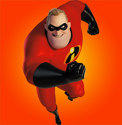
Mr. Incredible, a movie superhero is summoned by the wealthy weapons designer named Syndrome to conquer an evil robot, the Omnidroid 08. Syndrome is really testing the evil robot to see if a superhero can defeat it. What Syndrome is doing is a form of usability testing – he’s observing Mr. Incredible interact with the robot weapon so he can improve its performance.
And that’s what usability testing is about – observing a user interact with your software to determine how best to improve the product. Granted, it’s not as adrenaline pounding as testing a robot weapon, but the consequences of not testing can be far more serious.
What is usability testing?
A usability test is scripted with actions that you create for the end-user to perform while using your app. It’s very targeted and is intended to measure time-to-completion, percent completed and errors. You, as facilitator, observe and record the user’s action and reactions while they are going through the scripted test. You can test one feature or ten – it’s entirely up to you.
When do I conduct usability testing?
Usability testing can be performed at the beginning of an app redesign, or further down the road when you have high fidelity prototypes if this is a first-time app. The idea is to have iterative testing throughout the product lifecycle so you can benchmark usability performance. In the Incredibles, Syndrome waits till his evil robot product is fully developed before he does testing - not the best idea.
How many tests should I do?
There’s a rule of thumb that about five tests is enough to give you relevant feedback – I wouldn’t do less than that.
Syndrome only had to do one test to determine the weakness in his evil robot. More than five tests is great, but you have to consider the amount of data you are collecting and how much time it takes to arrange, conduct and analyze the test. Be mindful not to overload yourself.
How do I run a usability test?
First, you need to know what features, assumptions or goals you are going to test.
For instance, you may want to test only a portion of a transaction, like entering in credit card information. Or, you may test the entire purchasing experience. Next, you write the script for the user to follow. These are a set of instructions like ‘navigate to the shopping page’ or ‘select a product to put in your cart’ that you give to the user to follow during the test.
During the test, you sit next to the user so you can see what actions they take as well as see the screen they’re viewing. Take notes and record the screen and audio – this will be invaluable later on when analyzing the session. I like using Camtasia for the screen and audio recording.
And resist the urge to correct or help the user when they run into difficulties. Only intervene if the user is stuck and cannot advance in the script. Finally, encourage the user to ‘think aloud’. This means that the user says out loud what they are doing and thinking. This will provide insights into the user’s pain points.
Sometimes, you just can’t be physically present with the user. In that case, you can conduct the test remotely. There are several good software apps that assist you in conducting user testing remotely. An internet search on ‘usability testing software’ will provide you with many options to choose from.
No one likes taking a test!
Prepare your end-user for the test by first putting them at ease when you tell them that you are testing the software, not them.
Some people get very uncomfortable when they participate in a usability test – let them know they can stop the test at any time for any reason. You don’t want the user to feel trapped. Finally, explain what think aloud is and ask them to speak what they are thinking as they go through the script.
Analyzing the results
There are two types of results you’ll get from a usability test – quantitative and qualitative information.
Quantitative data will be your measures of time-to-completion and error rates. Quantitative data are the type of data that you can visualize as charts. Qualitative data, on the other hand, will come from a SUS (System Usability Score, to be covered in our next article) survey and/or a posttest interview. This type of data is textual in nature and gives you a feel for the user’s acceptance of the app. Both types of results are important to convey to internal stakeholders to create a more holistic picture of your app’s usability.
Share, share, share
Once you have compiled all the results, share it with as many internal stakeholders as you can. I like to hold a meeting and go through a slide deck highlighting both qualitative and quantitative data. And, keep the meeting short – a half hour should be enough time to present the results. The point is to socialize usability studies with the entire organization to gain traction and support for UX design.
You may not be testing Mr. Incredible, but even a standard usability test can totally skyrocket the success of your app.

How do you Create Delightful User Experiences? Task Flows!
January 2020
Ariel, the main character in The Little Mermaid, is fascinated with human beings. She collects human artifacts like forks or hairbrushes and studies human behavior so she can understand people better.
Too bad Ariel was not hip to the task flow that would’ve helped her get human behavior WAY faster.
What is a Task Flow?
A task flow is a diagram that breaks out each of your customer’s actions required to complete a single goal. It displays the steps your customer takes to move through your app.
These steps can be simple and outline a ‘happy path’ – which is a path with no errors. If your users’ goal is complex your task flow will likely contain multiple decision points and paths. A decision point is where the user has to make a choice, such as electing to rent a car or not while making an airline reservation. If the user elects to rent a car, this will include extra actions for the user to take.
Why create a Task Flow?
Task flows show you at-a-glance what actions your user choose and why she takes them. This understanding of the customer’s process at the core of user centered design – it’s all about the customer and identifying areas for improving their experience. Without knowing the problem the customer is facing, you can’t create a solution.
When’s the best time to start a Task Flow?
Task flows are usually created during the beginning of a project when you are still learning about the customers’ needs, goals and pain points. The objective of a task flow is to understand the customer’s perspective of their tasks and what their friction points are.
How to Build a Task Flow
A task flow starts with a goal – like, for example, buying an airline ticket. You take the goal and break it down into the individual steps the user takes. For instance, the user must select an origin and destination and date and time. Once this search is complete, the user selects a flight, selects seats and pays for the airfare. This would be the happy path. In reality, there are many more possible steps as the user is prompted to rent a car or reserve a hotel.
Once you have broken down the goal into individual actions the user takes, you put this into a flow chart diagram. How do you do this?
- The actions go into rectangles with lines connecting the linear actions.
- A decision point (like do you want to rent a car?) is represented by a diamond shape. This is usually a yes/no option with two lines coming out of the decision point representing the two paths possible.
- What you’ll end up with is a flow chart where the last box is the goal. In the example below, we show the path a user takes to purchase an airline ticket:
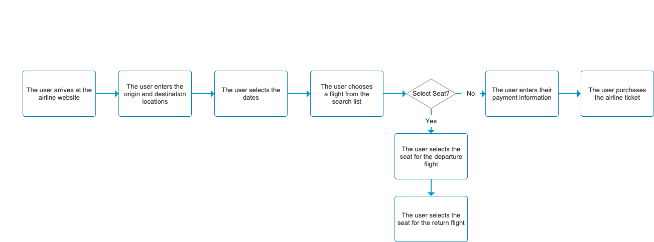
As you can see in this example, the task flow has one decision point – the option to select a seat on the plane. Here, the user can take one of two actions. Selecting a seat will add two more actions to the sequence, but it is not necessary to complete the transaction.
How to go with the Flow
Creating a task flow is harder than it seems. Each action needs to propel the user further along the path with the least amount of resistance, or friction. When you break a goal down into its individual actions, it’s easy to see why users become frustrated with software. There are so many steps and possibilities for errors.
How can you simplify the process and make it even better?
Once the task flow is drawn out, your next step is to analyze it and discover how you can streamline the process. This can include dropping unnecessary actions or combining like actions. Your mandate is to make the process as easy as possible for the customer. This means providing the minimal number of actions required to achieve the goal.
Had Ariel created a task flow for the fork or hairbrush, she might have understood human behavior a little better. With task flows, you can understand your customer’s behavior, goals and pain points to help you create a delightful user experience.

Journey Maps: Your roadmap to successful apps
December 2019
In Frozen 2, Queen Elsa is on a quest to save her kingdom. During her journey, she encounters many frustrations and obstacles. With perseverance and determination in her journey, Elsa is transformed by her experience and saves her kingdom -- the story reaches its conclusion.
Novice designers often take a long and winding road to UX design. But with journey maps, you’re on the road to success.
In UX design, we seldom encounter situations as dire as Elsa’s, but the journey a user takes through your app is no less important. Like Elsa, your customer starts with a goal and attempts to complete that goal through a series of tasks performed within your app. A successful user journey is one where the user can reach their goal with a minimal amount of frustration or friction.
Why document the User Journey?
The major takeaway is that Journey Maps create a conversation about your customer and how she experiences your product. The Journey Map produces a holistic view of your customer which can be shared company-wide to ensure a complete understanding of who the user is and what they want. This shared vision is necessary to create a positive user experience for your customer.
The Secret Ingredients to a Successful Journey Map
There are many types of Journey Maps (also called Customer Maps), but they all share common components:
- The Actor - a condensed persona of who the user is and what their goals are (see Creating UX Design Magic with Personas)
- A specific scenario (goal) – what is the customer trying to achieve? (see Don’t miss the most important step of UX Design)
- A series of user actions in a linear timeline tied to the screens they encounter
- User emotions during the actions. This can range from frustrations to a sense of accomplishment
- Comments during the process help fill out the narrative
- Insights from the user’s journey and opportunities for improvement
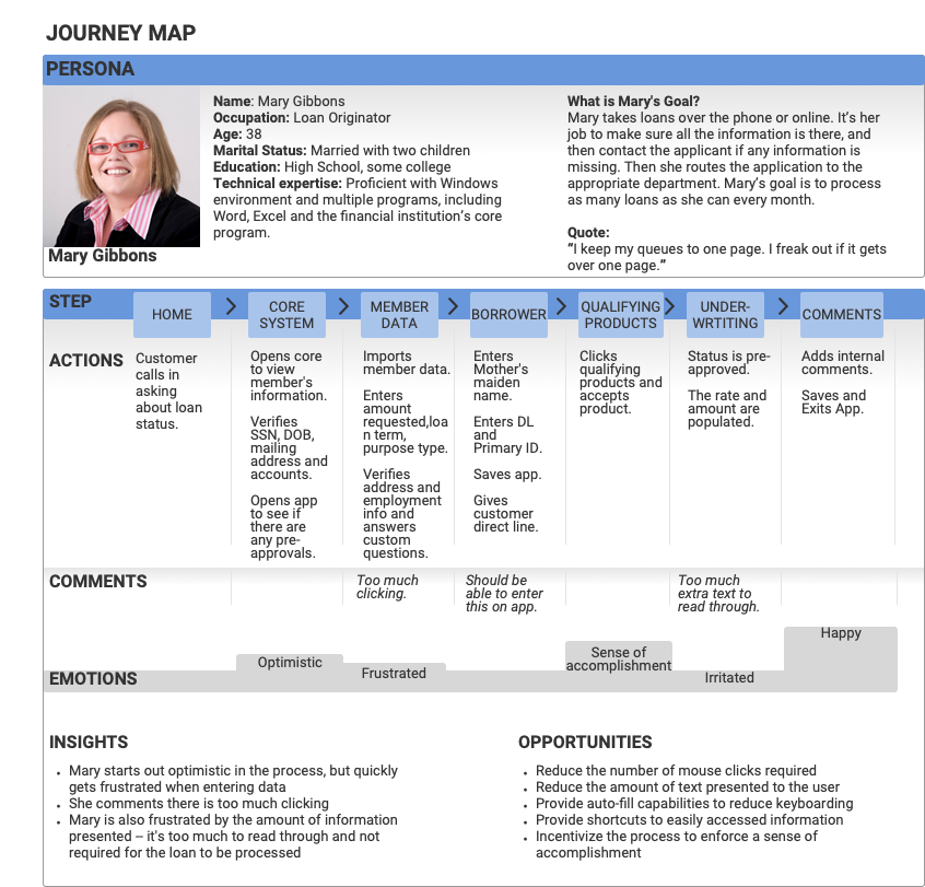 The information you need to fill in the journey map originates from the persona you created and a contextual inquiry where you observe the user in their environment working towards their goal (to be covered in a future article). In this way you can see your customer’s pain points firsthand. Download the Journey Map Template
“You Feel What You Feel and Your Feelings are Real.”
That’s what Olaf, the wise funny snowman in Frozen 2, would say about journey maps. The customer’s feelings about your app are real and valid. Any negative emotions arise from interaction frictions and can turn your customer off. It’s important to know when your customers are experiencing negative as well as positive emotions during their journey. In this way you can identify problem areas that need improving and success areas that are working for your customer.
“All one can do is the next right thing.”
Again, Olaf the wise snowman states the obvious that applies to UX design. All we can do is the next right thing. Knowing what that thing is, is paramount to designing user experiences. Stakeholder interviews, personas and journey maps are just part of the process. The next right step is task flows which we will cover in the next blog.

Creating UX Design Magic with Personas
December 2019
In J.K. Rowlings Harry Potter novels, Harry is characterized by being kind, witty, honest and brave. J.K. Rowlings spent a lot of time creating Harry’s personality. After all, Harry is the main character of the novels. Your highest priority as a UX Designer is to build empathy for the main character, and that requires that you fully define his or her personality.
The movie storyline is built from Harry’s goal (family), motivation (feels strongly against evil) and pain paints (of which there are many).
In User Experience design, this character-building is called a persona. The purpose is somewhat similar to defining a character in a movie — so you better understand the character’s goals, motivations and pain points in order to:
- Predict their next actions
- Be responsive to their needs
- Provide a delightful experience with your app
Real-world personas
A persona is a fictional character based on a sampling of real people you’ve interviewed for your stakeholder interviews (see “Don’t miss the most important step of UX Design”). You’ll want to make sure to capture some demographics about the target customer for your app, like age, education, marital status and other details that will help inform the design. When done well, you’ll have an intimate look at your prospective customer’s typical day at work.
This one-page document also includes a photo that represents the individual. Usually these photos are downloaded as royalty free images from paid sites like Shutterstock or free services like Pexels. Why include a photo? The photo literally gives a face to the persona, turning the abstract into a real person.
Your app may have more than one type of customer. If so, then you’ll need to create a persona for each type of customer.
How do you corral all the information from your interviews?
You may have a lot of unorganized information about your target customers. How do you organize all that information? By performing a card sort on the interviews (for more info on card sorting, read “Don’t miss the most important step of UX Design,”) this will help you gather the demographics, needs, goals, daily work life and pain points you’ll need to populate your persona documents.
How to maximize the benefits of your personas
Congratulations! You have a persona. Now what? The purpose of the persona is to humanize the target customer to increase empathy among the software team -- which results in a better user experience. As a UX designer, it’s your job to evangelize the persona. Share it, meet about it, post it to the intranet, stick it up on the wall, do whatever it takes to get the persona in front of your internal stakeholders — project managers, developers, UX/UI designers, and even the C-Suite.
Make sure you talk through the persona to explain the goals, motivations and pain points for your customers. The more customer-aware your internal stakeholders are, the better designed your app will be. Why? Because this puts the customer up front and center in the design process. And that’s what user-centered design is all about. Or, as Harry Potter’s chants when he wants to unlock things “ALOHOMORA!”
Personas are an integral part of user experience design. You may not solve the mystery of the Sorcerer's Stone, but with well-developed personas, you can solve the mystery of how to create a great user experience for your customers.
Stay tuned for the next blog in the UX design series: Journey Maps…
Don’t miss the most important step of UX Design
December 2019
Everyone agrees that app design needs UX design, but they don’t know where to start. Like Glenda the Good Witch said to Dorothy in The Wizard of OZ, “It's always best to start at the beginning.” After 20 years of designing user experiences for Fortune 500 companies as well as start-ups, I tend to agree with Glenda. The beginning to good UX design starts with interviewing your target customers, also referred to as stakeholder interviews.
Starting off on the right foot
Just like Dorothy started with one step on the yellow brick road, UX design starts with a customer interview. When you’re creating a new or redesigned app, the target customer interview is everything -- it serves as the foundation for user experience design. All UX design artifacts that are created during the design of an app – from personas to prototypes — spring forth from the first step on the UX Design road.
So, what exactly is a stakeholder interview?
The goal of your stakeholder interview is to gather information on the customer’s goals, needs, motivations and pain points. Only when you discover this information can you move forward to the next steps in the design process. The stakeholder interview is a face-to-face one on one session that lasts anywhere from a ½ hour to an hour.
A stakeholder interview is a simple affair, but it can lead to dramatic results
It’s just you and the interviewee sitting in a room that affords privacy and quiet. You have a list of prepared open-ended questions to ask the customer. Your goal is to get the customer talking as much as possible. Ideally, you do 20% of the talking and the customer does 80% of the talking. You can record the interview to transcribe or refer to later on. Don’t use a computer to take notes — use a pen and paper to take notes. This places less obstacles between you and the customer and makes the session more personable.
How to nail the stakeholder interview
Remember, you’re there to gather information on the customer’s goals, needs, motivations and pain points. So, the questions will follow this framework. Some generic questions may look like this:
- What is your goal in using this app?
- What are you using now to achieve your goal?
- What frustrations do you experience in achieving your goal now?
- Describe the steps you take to achieve your goal.
- How would you change your current app to make it better?
- What other apps do you admire for their ease of use?
How many interviews should I conduct?
There’s a rule of thumb that at least five interviews should be conducted. That will give you a broad scope of what your customers are looking for and what their pain points are. More interviews will help provide further details. But keep in mind, each interview requires a transcript of the interview which takes time to do. You don’t want to overload yourself with TMI -- too much information.
What do I do with all that information after the interview?
After five interviews, you will have around five hours of information to sort through. This can be a daunting task, but there is a way to help you organize your notes — a card sort. A card sort is a method whereby you write one feedback, one idea, one concept from the interview on a sticky note. For one interview, you should have around 30 – 50 sticky notes. The next step is to sort them into like groups. For instance, you may have one group on pain points, one group on UI ideas and one group on goals. You can then summarize your information to determine if there are any patterns emerging in terms of goals, pain points and tasks.
Next Steps
Now that you have conducted your interviews, transcribed the audio, taken your notes and performed your card sort, what do you do? The next step is to create a persona. A persona is a fictional character that is comprised of all the interviewees. This is a representation of your customer. And you might have more than one type of customer. We’ll cover personas in the next blog so stay tuned…

Why IBM is investing heavily in UX Design, and you should, too.
October 2017
“For years, our teams had a very engineering-centric culture.
We wanted to shift that towards a focus on users' outcomes.”
- Charlie Hill, IBM CTO
One UX designer for every 80 coders. That was IBM just five years ago.
Today, IBM is aiming to have one UX designer for every 8 developers. For mobile projects, it’s one UX designer for every 3 developers.
Why? IBM looked ahead and saw it needed to become a design-centered organization to stay competitive. It’s invested more than $100 million in doing so.
What does this emerging focus on user-centered UX design mean for your organization?
The Perils of Continuing to Design Like It’s 1999
“A focus on features let design fall to the wayside,” says Jared Spool, Founder of @UIE, about enterprise software. “You’re forced to stare at a screen straight out of 1995.”
It’s like traveling back in time. But not in a fun way.
For the enterprise, UX design has historically been an afterthought.1 But that’s changing.
Why? User expectations are being dramatically raised by simple, intuitive, user-focused B2B apps like Slack, Mailchimp, Stripe and Trello. These extremely successful apps have been designed to delight, even hook, users on their product.
So it’s no surprise Salesforce, Ford, IBM and others are jumping on the design bandwagon.
The takeaway: It’s a whole new ballgame. One in which a user-centered UX design will become a key competitive advantage.
Design to Save Time and Money and Win Market Share
It’s simple. User-centered UX design makes extremely good bottom-line business sense.
“When we started talking to our customers and saw how they used our service,
it was the defining moment of success that turned the company around.”
- Mike Gebbia, Airbnb
Slash development time and costs
User-centered design focuses on solving users’ problems and creating a great experience right from the start. By doing so, it cuts development time and avoids costly redesigns.
Case in point: American Airlines, which cut its development costs by 60-90%. How? They caught and corrected usability problems at the design stage. Brilliant!
Case in point: MacAfee Software cut their support costs by 90% after they integrated usability testing into their process.2 What else produces massive results like this?
Stand out in a crowded marketplace.
User-centered software that’s simple, intuitive, solves users’ problems and gives them a delightful experience sets you apart from the competition.
Case in point: Airbnb went from the brink of failure to a $10 Billion valuation by focusing on user research.2 If user research can do this for Airbnb, imagine what it could do for your company.
The takeaway: Apple CEO Tim Cook says, “Most business models have focused on self interest instead of user experience.” Don’t make this mistake. Leverage the powerful tools of UX design to win market share and scale your success.
1. IBM'S Got a plan to bring design thinking to big business Wired Magazine.
2. Enterprise UX Industry Report 2017-2018, UXPin Inc.
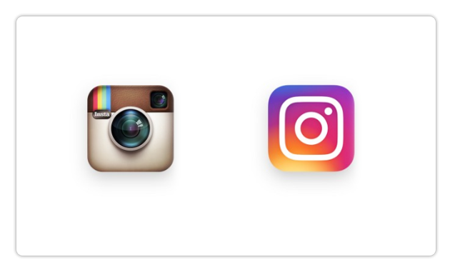
Instagram goes flat, and the internet goes crazy.
May 2016
Recently, Instagram replaced its realistic-looking (skeuomorphic) camera icon with a flat neon icon — and the internets responded with what The New York Times called “The Great Instagram Logo Freakout of 2016.”
Why all the angst? Instagram was one of the last flat icon design holdouts. Today, virtually every user interface is flat — with a minimalist design approach that emphasizes two-dimensional elements, bright color palettes and lots of white space.
Will flat design continue to reign for decades to come? Let’s revisit UX design history.
Flat design used to be the ONLY design choice
In the late 80s, the limits of technology meant icons and other user interface elements had to be flat. Having a low-res palette of 8 to 64 colors made it impossible for designers to use one of the most powerful principles of usability. This principle — affordance — allows an icon or interface to suggest its function, such as a door knob suggests turning, making it more intuitive and user friendly.
Then design got 3-D and realistic…
As resolution and color depth increased in the 90’s, designers eagerly threw off the chains of flat design. Skeuomorphism – the practice of making items resemble their real-world counterparts – became the standard. Buttons got drop shadows suggesting they could be pressed. Icons and interfaces got gorgeous detail, color and a richness in depth, texture and realism that mimicked the real world. User-friendly design flourished.
…Until that became stale and boring
Skeuomorphic icons and interfaces became so overused, it was inevitable that the pendulum would swing back the other way. Soon, UI designers inspired by Apple’s elegant minimalism were focusing on removing visual clutter, communicating function more subtly, forgoing heavy shadows and using large amounts of white space. Microsoft furthered the trend with their Metro UI. Today, this flat, minimalist approach dominates the web, mobile apps and operating systems.
Flat design has its flaws
Everything is on the same plane and everything is in the foreground with flat design. That means that clickable controls look the same as interface elements that are not. The user has to figure out what is clickable by moving their mouse over the screen and waiting for the cursor to change its shape. That’s easier for millennials than it is for some boomers, who are more accustomed to 3-D realistic design.
What’s next?
Is flat design a viable usability approach that will stand the test of time? There’s no doubt it provides a cleaner look, removing unnecessary detail that detracts from a user interface. At the same time, its minimalism can force the user to work harder.
Here’s my prediction. I believe the pendulum will come to rest somewhere between flat and skeuomorphic design – combining the best of both worlds.
3 RULES THAT WILL HELP YOU HARNESS THE POWER OF “LESS IS MORE”
February 2016
Less is more. Simpler is better. Indeed, “simplicity is the ultimate sophistication,” according to Leonardo da Vinci. These days, we all know that — UX designers and clients alike.
The problem is we forget it. Or, as is more often the case, our brains become so inundated with project specs, requirements, revisions and checklists, simplicity doesn’t just leave the auditorium, it flees the country.
Here, gleaned from the various stages of my design career, are 3 suggestions that will help you leverage the power of “Less = More.”
1. You don’t have to draw every feather on the bird
I had a note pasted to my desk lamp when I was a biomedical illustration student. It read: ‘“Don’t forget composition, light source and shadow, perspective, stroke, contrast, focal point and balance.” I was trying so hard to remember all the elements that went into good design as I sat at my drafting table creating illustrations that I exhausted myself.
I consulted one of my teachers about this. His advice was simple yet profound: “You don’t have to draw every feather on a bird to know it’s a bird.”
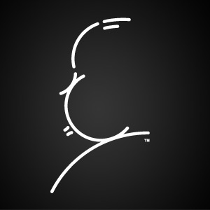
It’s true. The most effective design today just suggests what it’s supposed to represent and lets the viewer fill in the gaps. It eliminates everything nonessential. Case in point: famous film director Alfred Hitchcock’s powerful and iconic self portrait. It contains only 9 lines, yet instantly conveys the personality of the genius who brought us The Birds and Psycho.
2. Go small and think inside the box
In the middle of my career — when I created icons for America Online, Pacific Bell, Palm Pilot and others — I learned to love creative constraints.
There was no other way to go. Pixels were huge and colors extremely limited back then.
I started teaching other software designers how to create icons. In the first lesson, I gave them a postage stamp and a wide felt-tipped pen and told them to draw a picture on the back of the stamp. Once they mastered this lesson, they had the essence of icon design – that economy, creativity and simplicity are everything.
We always want to go big. Next time you’re stuck, try asking yourself “what would happen if I went small and stayed inside the box?” You might be happily surprised!
3. Stand outside the box and think outside the lines
In recent years, I’ve focused on user experience and UX design at the enterprise level for corporations like Wells Fargo, PG&E and Autodesk.
UX design at this scale requires a wide creative focus and a mastery of many different disciplines. It’s vitally important to look outside your industry and stay open to new perspectives and ideas from unexpected sources. This is the grist for creating great software interfaces.
Yet what is true for icons is also true for UX design at the enterprise level: economy of form and simplicity of use are key. You play with new perspectives and fresh ideas and see which stick. And then you begin paring down — seeing how much you can take away from the interface without degrading functionality. That’s how you create an elegantly simple app that users adore
Want to harness the power of Less is More? Stop drawing every feather. Go small. And stand outside the box.
What My 3-Year-Old Taught Me about the Internet of Things
December 2015
Tired and totally exhausted, we arrived in the middle of the night at our hotel in Costa Rica for a long-awaited family vacation. Standing in the doorway of our room, we felt along the walls for the light switch, but there wasn’t one. In the faint light of the moon, we could see a lamp on a bedside table.
My three-year-old daughter marched passed us, walked up to the lamp and touched it with both her hands. Presto! The touch-light turned on. ‘How did you know to do that?’ we asked her. She looked at us and shrugged her shoulders, replying ‘I don’t know’.
Curiosity can literally turn on the light
Three-year-olds learn about their world by touching everything. So a touch lamp is the perfect user interface for a three-year-old who doesn’t have full motor skills for small tiny lamp knobs, but is full of curiosity. And that is how the User Experience of things will help make the Internet of Things a success; by applying relevant usability principles with creativity and innovation to make an object usable.
UX design will unlock the vast power of the Internet of Things
The Internet of Things is about interacting with the world in a whole new way — through objects embedded with electronics, software, sensors, and network connectivity. Clothes that change color with the music. Lights, doors and appliances in your home you can control remotely. Sensors and apps that monitor your health and alert your doctor if something goes wrong. It’s an exciting time and a promising market.
Yet without UX design that’s as elegantly simple and intuitive as the table lamp my 3-year-old “magically” was able to turn on years ago, it could become the Internet of Frustration instead.
A lot goes into making an object usable
One aspect of usability — for devices that have a screen interface or are operated by direct manipulation — is affordance. Affordance is how an object suggests its operation. You can tell how it works just by looking at it. A door knob suggests turning, a drawer handle suggests pulling. Another aspect of usability is efficiency. Does your product help solve a problem for the user? Does it make it easier, faster, cheaper or more fun to reach the users’ goal?
Bottom line: if your internet “thing” doesn’t solve a problem, it won’t be used as a solution. These are just a few of the usability methods that affect your success in the Internet of Things.
Empathy has an ROI. Just ask any successful UX Designer.
November 2015
Does it sometimes feel that your job is like throwing spaghetti against a wall to see what sticks?
End users, after all, don’t usually know what they want or need until they see it. So we get busy meeting deadlines and racing towards a final solution – doing iterative mockups, prototypes, sketches and interactive wireframes — and in the process sometimes our most important contribution, our humanity, gets lost.
“Empathy is hard to outsource and automate, but it makes the world a better place.”
Daniel Pink, Author of Drive
UX design requires us to be fully human
Our job, as UX Designers, isn’t to create something we like, or even something our clients like. We are charged with designing an experience that solves people’s problems and makes their lives better.
It’s basic and that profound.
Regardless of the project, empathy is an essential component of great UX design. It requires us to immerse ourselves in the end user’s day and world. Listen deeply to their needs, frustrations and desires. And, from that research, create a simple, elegant solution that results in the best experience possible for them.
A recent UX project brought the power of our vocation — and the necessity of doing it well — home to me in spades.
UX design can literally save lives
Too sick for regular dialysis, late-stage kidney patients undergo peritoneal dialysis at home in order to stay alive. It’s a very uncomfortable procedure that pumps saline solution into their abdomen to draw out the toxins their kidneys can no longer process. While this is going on, the patient can’t roll over or turn in their sleep. Hours later the fluid is removed and disposed of.
Every week, patients visit their doctor, bringing a USB drive with detailed data on their in-home dialysis sessions. My task was to design how those results would be displayed for the doctor.
“Empathy is about having the ability to relate to and connect with people for the purpose of inspiring and empowering their lives.”
Oprah Winfrey
Empathy for the end user
Having thoroughly done my research, I understood the pain, discomfort and, sometimes, desperation these patients and their families endured. I also realized how truly precarious their health was.
How could any of us not put our all into a project like this?
I was committed to creating the best possible app – so that any potential problems would leap out at the doctor. I wanted to make it quick and easy for her to do her work as accurately as possible. That way, the patient would be well taken care of, yet only have to spend a short time in the clinic.
My solution combined three different applications into one, using data visualization so the doctor could see any problems at a glance. This dramatically reduced the chance that something critical might slip by – potentially saving lives.
Most of the projects we work on don’t have life or death consequences like this one.
But it reminds me why we have to bring our curiosity and empathy with us to work every day. That’s why I wanted to share this with you as well.
Great UX design not only helps people, it also makes excellent business sense. Apps and interfaces designed with empathy (backed up by good research) can be easier, faster and less expensive to create… and make the work and the lives of others better.
With empathy in the picture, it’s a win-win for everybody.
The smart way to save 90% on software development
October 2015
We’ve all been there. Your department is charged with creating new enterprise software, and it has to get to market as soon as possible. The boss is breathing down your neck. And a huge deadline is looming.
Who needs UX Design? You find yourself asking. We can do without it. Or do it later.
Having been on the frontlines of many software projects for large corporations, I can tell you that if you don’t take the time to do UX research up front, it will come back to bite you in the rear. Big time.
The truth is – and many research studies confirm this – fixing a UX problem in software already in development can cost 10 times more than fixing it in the design stage. That’s often why we’re called in: to fix problems at this stage.
UX Design makes development easier and cheaper
That’s why I love it when clients bring us in at the beginning. I know how smoothly and cost-effectively projects can go when UX Design is part of the analysis and design phase.
UX Design will help you help you solve issues before they become problems -- by employing several user-centered design processes:
- Defining the problem that your app is helping to solve
- Identifying your target audience
- Mapping out the app by creating wireframes and task flows
- Testing these wireframes and task flow with target users
The good news: UX Design takes way less time than you think
It can take as little as 40 hours for a small app or up to a month for enterprise projects. Testing with target users can be accomplished fairly quickly, sometimes taking less than a week.
And it doesn’t have to be super complicated. You’ll find that as little as 5 target users will give you 80% of the information you need to tell if you’re on the right track.
Worried about how you’ll justify the cost of UX Design? Regardless of the size of the project, we can promise you that your ROI will result in development cost savings and increased usability which means higher profits.